UI Mockups
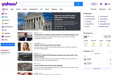
Screenshot Of The Yahoo Homepage
Screenshot of the {argument name="website" default="Yahoo"} homepage.
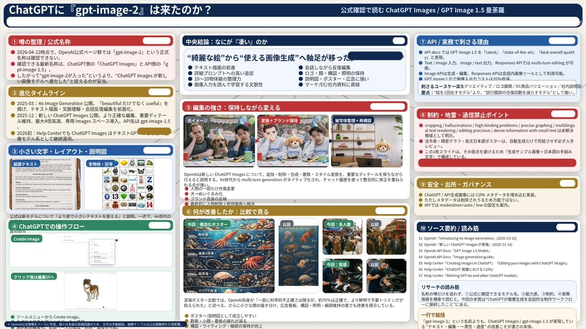
{ "type": "infographic dashboard", "style": "corporate presentation slide, dense information layout, flat design", "header": { "left_title": "{argument name=\"main title\" default=\"ChatGPTに『gpt-image-2』は来たのか?\"}", "right_subtitle": "{argument name=\"subtitle\" default=\"公式確認で読む ChatGPT Images / GPT Image 1.5 曼荼羅\"}", "background_color": "{argument name=\"theme color 1\" default=\"dark blue\"}" }, "layout": { "columns": 3, "sections": [ { "id": 1, "title": "① 噂の整理 / 公式名称", "color": "{argument name=\"theme color 2\" default=\"red\"}", "content_type": "3 bullet points" }, { "id": 2, "title": "② 進化タイムライン", "color": "gold", "content_type": "3 timeline bullet points" }, { "id": 3, "title": "③ 小さい文字・レイアウト・説明図", "color": "blue", "content_type": "2 embedded images showing text document and icon grid" }, { "id": 4, "title": "④ ChatGPTでの操作フロー", "color": "green", "content_type": "UI mockups showing chat interface and dog image" }, { "id": "central", "title": "中央結論:なにが『凄い』のか", "color": "dark blue", "subtitle": "{argument name=\"central conclusion\" default=\"“綺麗な絵”から“使える画像生成”へ軸足が移った\"}", "content_type": "2 columns of 4 bullet points each" }, { "id": 5, "title": "⑤ 編集の強さ:保持しながら変える", "color": "red", "content_type": "3 sequential images showing photo editing progression" }, { "id": 6, "title": "⑥ 何が改善したか:比較で見る", "color": "gold", "content_type": "6 comparison images (This time vs Before) for posters, crowds, textures" }, { "id": 7, "title": "⑦ API / 実務で刺さる理由", "color": "blue", "content_type": "3 bullet points" }, { "id": 8, "title": "⑧ 制約・地雷・過信禁止ポイント", "color": "red", "content_type": "3 bullet points" }, { "id": 9, "title": "⑨ 安全・出所・ガバナンス", "color": "gold", "content_type": "3 bullet points" }, { "id": 10, "title": "⑩ ソース要約 / 読み筋", "color": "dark blue", "content_type": "list of 7 sources and a summary box" } ] } }
Use this Infographic Dashboard prompt as a base. Replace the subject, product details, environment, lighting, brand colors, and output ratio while keeping the app-ui-mockup intent and luxury, editorial, photorealistic direction stable.
Choose the frame for the destination first, then use 1K, 2K, or 4K based on output quality needs. Product images and posters usually benefit from higher resolution.
Infographic Dashboard works because it starts from the image job, then controls subject, composition, lighting, style, and frame. It is best for app ui mockup while keeping the luxury, editorial, photorealistic direction stable.
Related prompts
Screenshot of the {argument name="website" default="Yahoo"} homepage.
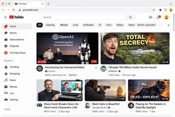
{ "type": "web browser UI mockup", "platform": "{argument name=\"platform name\" default=\"YouTube\"}", "browser_window": { "style": "macOS light mode", "tab": "YouTube", "url_bar": "youtube.com" }, "layout": { "header": { "components": ["hamburger menu", "platform logo", "search bar", "create video icon", "notifications bell", "user profile avatar"] }, "sidebar": { "position": "left", "item_count": 11, "sections": [ { "name": "Main", "items": ["Home", "Shorts", "Subscriptions", "Originals", "YouTube Music"] }, { "name": "Explore", "items": ["Trending", "Shopping", "Music", "Movies", "Live", "Gaming"] } ] }, "main_content": { "category_tags": { "count": 10, "labels": ["All", "Gaming", "Music", "Live", "Podcasts", "AI", "Cars", "Mixes", "News", "Recently uploaded"] }, "video_grid": { "card_count": 5, "cards": [ { "position": "top left", "size": "large", "thumbnail_description": "Sam Altman and Greg Brockman sitting on a stage next to a standing humanoid robot, text overlay 'OpenAI Introducing Our Humanoid Robot', LIVE badge", "video_title": "{argument name=\"featured live stream title\" default=\"Introducing Our Humanoid Robot\"}", "channel_name": "{argument name=\"featured live stream channel\" default=\"OpenAI\"}", "metadata": "482K watching now" }, { "position": "top right", "size": "large", "thumbnail_description": "surprised man's face on the left, a large mansion hidden in a forest with an explosion on the right, bold yellow text overlay '{argument name=\"top right thumbnail text\" default=\"TOTAL SECRECY\"}'", "video_title": "{argument name=\"top right video title\" default=\"I Bought 100 Million Dollar Secret House!\"}", "channel_name": "MrBeast", "metadata": "4.1M views, 19 hours ago, 20:49 duration" }, { "position": "bottom left", "size": "small", "thumbnail_description": "Steve Carell holding a laptop showing a scene from The Office", "video_title": "Steve Carell Breaks Down His Most Iconic Characters | GQ", "channel_name": "GQ", "metadata": "987K views, 2 days ago, 17:46 duration" }, { "position": "bottom middle", "size": "small", "thumbnail_description": "man looking through a spyglass at a sailing ship on the ocean at sunset", "video_title": "Black Sails Is Beautiful!", "channel_name": "Savage Books", "metadata": "606K views, 2 days ago, 17:46 duration" }, { "position": "bottom right", "size": "small", "thumbnail_description": "creepy masked killer character from a video game with text overlay 'DEAD OF DAYLIGHT'", "video_title": "Playing As The Seekers In Dead By Daylight", "channel_name": "Unknown", "metadata": "806K views, 1 day ago, 28:39 duration" } ] } } } }
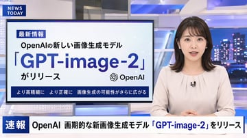
A photorealistic television news broadcast scene featuring a {argument name="anchor appearance" default="young Japanese female with shoulder-length dark hair wearing a light beige blouse"} and a small black lapel microphone, sitting at a news desk and speaking directly to the camera. The studio background is modern with blue and white lighting and a blurred nighttime city skyline on the right. In the top left corner, there is a dark blue graphic with the white text "{argument name="channel logo text" default="NEWS TODAY"}". To the anchor's left is a large presentation monitor displaying a news graphic with a white background and light blue network nodes. The monitor features a dark blue "最新情報" tag, the text "{argument name="subheadline" default="OpenAIの新しい画像生成モデル"}", a large prominent headline "{argument name="main headline" default="「GPT-image-2」"}", the text "がリリース", an OpenAI logo, and a dark blue bottom banner reading "より高精細に より正確に 画像生成の可能性がさらに広がる". Across the bottom of the entire screen is a news ticker lower third with a dark blue "速報" box and the scrolling text "{argument name="ticker text" default="OpenAI 画期的な新画像生成モデル「GPT-image-2」をリリース"}".
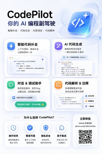
{ "type": "app promotional infographic poster", "style": "clean, modern, glassmorphism, soft shadows, 3D icons", "theme": "{argument name=\"primary color theme\" default=\"blue and white\"}", "header": { "title": "{argument name=\"app name\" default=\"CodePilot\"}", "subtitle": "{argument name=\"subtitle\" default=\"你的 AI 编程副驾驶\"}", "features_list": "智能补全 · 代码生成 · 问答调试 · 代码解析", "main_icon": "glossy 3D rounded square, blue gradient, white {argument name=\"main icon symbol\" default=\"</>\"} and sparkles" }, "layout": { "sections": [ { "title": "feature_cards", "position": "middle grid", "count": 4, "items": [ { "label": "智能代码补全", "icon": "blue lightning bolt", "description": "上下文感知, 精准补全 让编码更快一步", "ui_element": "macOS style code window with Python calculate_total function" }, { "label": "AI 代码生成", "icon": "purple magic wand", "description": "根据自然语言描述 一键生成函数 & 脚本", "ui_element": "chat prompt bubble and code window with Python quick_sort function" }, { "label": "对话 & 调试助手", "icon": "green chat bubble", "description": "自然语言提问、定位 Bug 边聊边改, 高效解决问题", "ui_element": "chat interface with user question and green AI resolution bubble" }, { "label": "代码解析 & 注释", "icon": "orange document with magnifying glass", "description": "快速理解复杂代码 自动生成注释与说明", "ui_element": "code window with JS fetchData function and 3 floating action tags: 自动注释, 逻辑解析, 一键复制" } ] }, { "title": "为什么选择 CodePilot?", "position": "bottom left", "count": 4, "labels": ["提升效率", "精准可靠", "隐私安全", "易于集成"], "icons": ["clock", "checkmark", "shield", "puzzle piece"] }, { "title": "立即体验", "position": "bottom right", "count": 1, "elements": ["GitHub 开源项目", "{argument name=\"github link\" default=\"github.com/op7418/CodePilot\"}", "QR code"] } ] } }
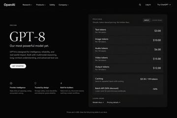
{ "type": "dark mode web page UI mockup", "theme": "sleek, modern, dark theme with white and light grey text", "header": { "logo": "{argument name=\"company name\" default=\"OpenAI\"}", "navigation": ["Research", "Products", "Safety", "Company"], "actions": ["Search icon", "Log in", "Try ChatGPT button"] }, "layout": { "left_column": { "label": "PRICING", "headline": "{argument name=\"model name\" default=\"GPT-8\"}", "subheading": "{argument name=\"main tagline\" default=\"Our most powerful model yet.\"}", "description": "GPT-8 is designed for intelligence, reliability, and real-world impact. Built with multimodal reasoning, long-context understanding, and advanced tool use.", "button": "GET STARTED", "features": { "count": 3, "items": [ {"icon": "brain", "title": "Frontier intelligence", "desc": "State-of-the-art reasoning, coding, and problem solving."}, {"icon": "shield", "title": "Trusted by design", "desc": "Stronger safety, more steerability, and enterprise-grade reliability."}, {"icon": "lightning bolt", "title": "Built for builders", "desc": "Native tool use, structured outputs, and long-context workflows."} ] } }, "right_column": { "type": "pricing card", "header": "PRICING - Simple, token-based pricing. No hidden fees.", "toggle": ["INPUT", "CACHE READ"], "token_pricing": { "count": 5, "rows": [ {"name": "Text tokens", "unit": "Per 1M tokens", "price": "{argument name=\"text token price\" default=\"$3.00\"}"}, {"name": "Image tokens", "unit": "Per 1M tokens", "price": "$10.00"}, {"name": "Audio tokens", "unit": "Per 1M tokens", "price": "$6.00"}, {"name": "Video tokens", "unit": "Per 1M tokens", "price": "$15.00"}, {"name": "Output tokens", "unit": "Per 1M tokens", "price": "{argument name=\"output token price\" default=\"$12.00\"}"} ] }, "additional_features": { "count": 2, "rows": [ {"name": "Caching", "desc": "Save on repeated inputs with caching.", "price": "$0.30 / 1M tokens"}, {"name": "Batch API (50% discount)", "desc": "Lower costs for asynchronous workloads.", "price": "-50%"} ] }, "footer_links": ["LEARN MORE", "Model docs", "Pricing details"] } }, "footer": "Prices are in USD. View the full pricing table in our docs." }

{ "type": "social media short video app interface mockup", "main_image": { "subject": "{argument name=\"subject description\" default=\"young Asian woman with long dark hair wearing a white off-the-shoulder top\"}", "pose": "looking back over her shoulder at the camera, gentle smile, hair blowing slightly in the wind", "setting": "{argument name=\"background location\" default=\"riverside promenade at sunset with a tall modern tower and city skyline\"}", "lighting": "golden hour, warm sunlight reflecting on the river" }, "ui_layout": { "top_bar": { "status_icons": ["time 9:41", "cellular signal", "wifi", "battery 100"], "navigation": { "left": "menu icon", "center_tabs": ["经验", "团购", "关注", "{argument name=\"active top tab\" default=\"推荐\"}"], "right": "search icon" } }, "right_sidebar": { "count": 6, "elements": [ "profile picture with pink plus button", "heart icon with text '23.6万'", "chat bubble icon with text '1.6万'", "star icon with text '2.8万'", "share arrow icon with text '3.7万'", "spinning music record icon" ] }, "bottom_left_overlay": { "username": "{argument name=\"username\" default=\"@小鹿的日常\"}", "caption": "{argument name=\"caption text\" default=\"吹着晚风,看着日落,这一刻好治愈~ 🌅\"}", "audio_track": "🎵 原声 @小鹿的日常创作的原声" }, "bottom_navigation_bar": { "count": 5, "tabs": [ "首页", "朋友 (with red badge '2')", "central plus button in rounded square", "消息 (with red badge '5')", "我" ] } } }