
Image2Studio
Examples

gpt-image-2

Bold Editorial Poster In A Brutalist Swiss-modern Infographic Style On A

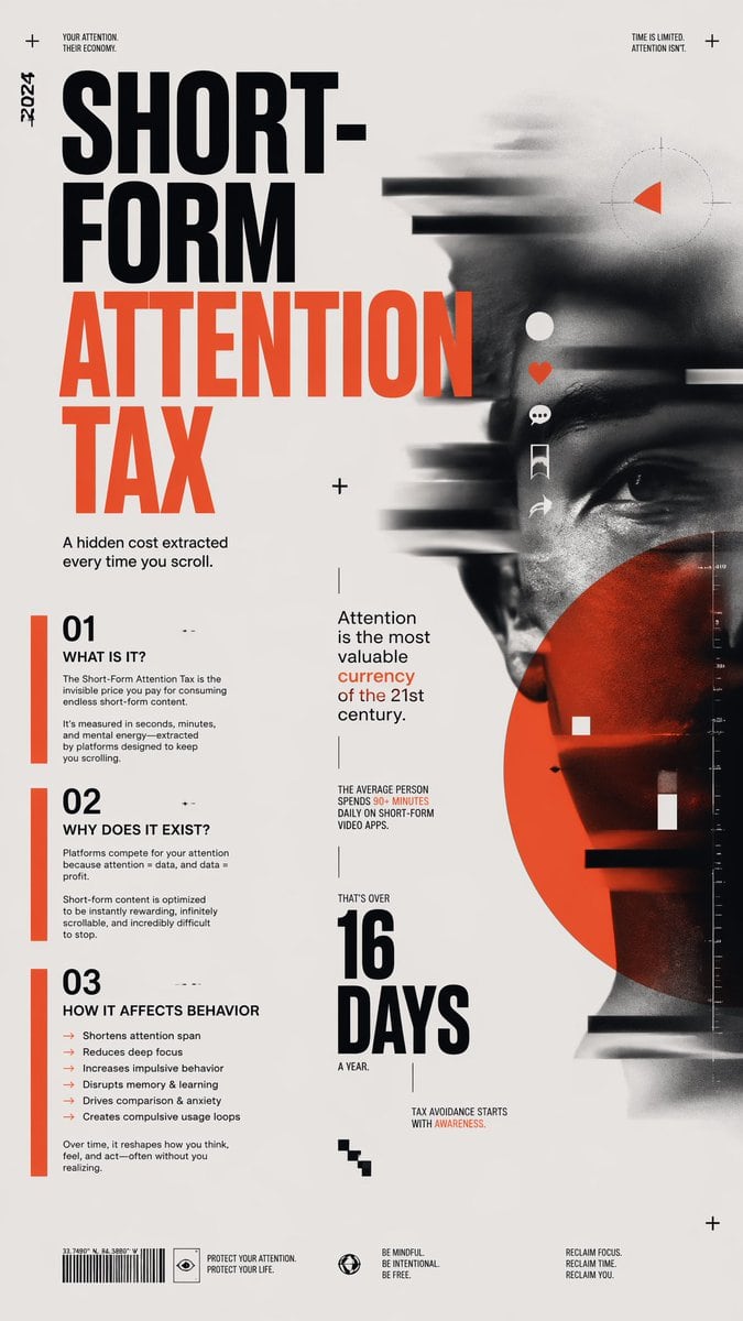
A bold editorial poster in a brutalist Swiss-modern infographic style on a light warm-gray background, portrait orientation, with a split composition: oversized typography dominating the...

A bold editorial poster in a brutalist Swiss-modern infographic style on a light warm-gray background, portrait orientation, with a split composition: oversized typography dominating the...
Prompt

A bold editorial poster in a brutalist Swiss-modern infographic style on a light warm-gray background, portrait orientation, with a split composition: oversized typography dominating the left half and a blurred monochrome human face dominating the right half. The main headline is stacked in huge condensed sans-serif uppercase text reading {argument name="headline text" default="SHORT-FORM ATTENTION TAX"}, with “SHORT-FORM” in black and “ATTENTION TAX” in vivid red-orange. Along the far left margin place a small vertical year mark reading “-2024”. At the top left add tiny uppercase text “YOUR ATTENTION. THEIR ECONOMY.” and at the top right add tiny uppercase text “TIME IS LIMITED. ATTENTION ISN’T.” with small plus-sign registration marks near the corners. Beneath the headline on the left, add the subheading “A hidden cost extracted every time you scroll.” Create 3 numbered information blocks stacked down the lower left side, each marked by a vertical red-orange bar and large black numerals: section 01 titled “WHAT IS IT?”, section 02 titled “WHY DOES IT EXIST?”, and section 03 titled “HOW IT AFFECTS BEHAVIOR”. Under section 01, include body text explaining that the Short-Form Attention Tax is the invisible price paid for consuming endless short-form content and that it is measured in seconds, minutes, and mental energy extracted by platforms designed to keep you scrolling. Under section 02, include body text explaining that platforms compete for attention because attention, data, and profit are linked, and that short-form content is optimized to be instantly rewarding, infinitely scrollable, and hard to stop. Under section 03, include exactly 6 bullet points in red-orange dash style: “Shortens attention span”, “Reduces deep focus”, “Increases impulsive behavior”, “Disrupts memory & learning”, “Drives comparison & anxiety”, and “Creates compulsive usage loops”, followed by a short concluding sentence about reshaping how you think, feel, and act. In the center-left and lower-middle areas, add supporting editorial typography in mixed sizes: “Attention is the most valuable currency of the 21st century.” with the word “currency” in red-orange; a small stat block saying “THE AVERAGE PERSON SPENDS 90+ MINUTES DAILY ON SHORT-FORM VIDEO APPS.” with “90+ MINUTES” in red-orange; a giant stacked numeric statement reading “16 DAYS” in black with the surrounding text “THAT’S OVER” above and “A YEAR.” below; and a small closing line “TAX AVOIDANCE STARTS WITH AWARENESS.” On the right half, show a close-up portrait of a human face in black and white, partially cropped, looking forward, with a serious neutral expression. Apply heavy horizontal motion blur, digital smear, scanline-like streaks, and glitch bars crossing the face, especially across the forehead, nose, and mouth. Overlay exactly 5 vertical social-media style interface icons near the center-right of the face: a white circle/profile dot, a red-orange heart, a white speech bubble, a white bookmark ribbon, and a white share arrow. Add a large translucent red-orange circle covering the lower-right part of the face. Include subtle HUD-like graphic elements: a faint circular reticle with a small red-orange triangular wedge near the upper right, a thin vertical measurement scale near the far right edge, a few white square markers, small black and white horizontal bars, and scattered tiny plus signs for layout texture. At the bottom, place a barcode on the left with tiny coordinate-like text above it, then 3 footer callouts spaced across the width: “PROTECT YOUR ATTENTION. PROTECT YOUR LIFE.”, “BE MINDFUL. BE INTENTIONAL. BE FREE.”, and “RECLAIM FOCUS. RECLAIM TIME. RECLAIM YOU.” Use a restrained palette of black, off-white, and red-orange only. The overall look should feel like a high-end social critique poster, mixing typographic activism, data editorial design, and dystopian tech-noise portraiture, with crisp layout, strong negative space, and print-poster realism.

Prompt structure
  • Modelgpt-image-2
  • Use caseavatar
  • Styleeditorial, minimal, luxury
  • Aspect ratioFlexible
Best used for
  • Use caseavatar
  • Styleeditorial, minimal, luxury
  • Recommended specs1:1, 4:5, 16:9, or 9:16
  • ModelGPT Image 2
How to customize

Use this Bold Editorial Poster In A Brutalist Swiss-modern Infographic Style On A prompt as a base. Replace the subject, product details, environment, lighting, brand colors, and output ratio while keeping the avatar intent and editorial, minimal, luxury direction stable.

Editable variables
  • SubjectReplace the product, person, scene, interface, or object being generated.
  • Use caseKeep or rewrite the destination as avatar, ad creative, cover image, poster, or ecommerce hero.
  • FrameChoose 1:1, 4:5, 16:9, or 9:16 based on the final placement.
  • Brand cuesAdd colors, materials, props, text-safe space, and the platform where the image will be used.
Recommended specs

Choose the frame for the destination first, then use 1K, 2K, or 4K based on output quality needs. Product images and posters usually benefit from higher resolution.

Pre-generation checklist
  • CheckSubject, lighting, composition, and frame are specific enough to review.
  • CheckText-safe space is included when the image will carry a headline or ad copy.
  • CheckResolution, credit cost, and final destination are checked before generation.
Why this prompt works

Bold Editorial Poster In A Brutalist Swiss-modern Infographic Style On A works because it starts from the image job, then controls subject, composition, lighting, style, and frame. It is best for avatar while keeping the editorial, minimal, luxury direction stable.

Common questions
  • Can I use it directly?Yes. Replace the subject, brand cues, and frame, then generate in Image2Studio.
  • Which ratio should I use?Choose 1:1, 4:5, 16:9, or 9:16 based on the destination.