Image2Studio
Examples

gpt-image-2

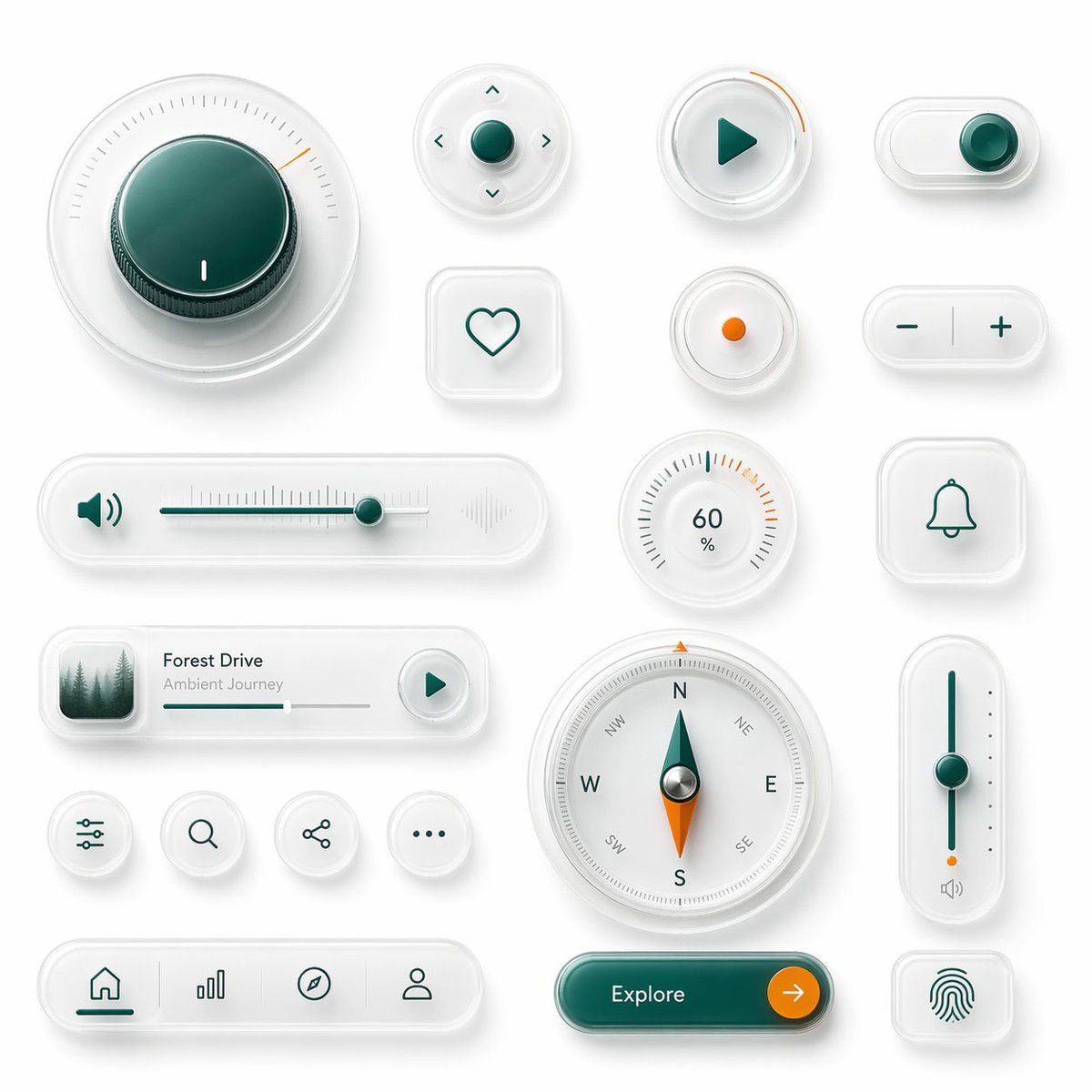
Glassmorphism UI Component Showcase

Ready-to-edit glassmorphism UI component showcase image prompt.

Ready-to-edit glassmorphism UI component showcase image prompt.
Prompt

{"type":"glassmorphism UI component showcase","style":"premium minimalist neumorphic interface kit, frosted translucent white acrylic, soft shadows, subtle reflections, rounded corners, clean white background, teal green and orange accent colors, ultra-detailed 3D product render, top-down view","palette":{"background":"soft light gray-white","primary":"deep teal green","secondary":"bright orange","material":"milky translucent glass with satin plastic details"},"layout":{"composition":"single canvas with evenly spaced floating UI widgets arranged in a clean design-system presentation","sections":[{"title":"large dial","position":"top left","count":1,"labels":["circular rotary knob with radial tick marks and one orange indicator"]},{"title":"direction pad","position":"upper center","count":1,"labels":["round four-way control with center button and four arrow icons"]},{"title":"play button","position":"upper center-right","count":1,"labels":["round button with teal play triangle and orange progress arc"]},{"title":"toggle switch","position":"upper right","count":1,"labels":["horizontal pill toggle switched on"]},{"title":"favorite button","position":"mid upper center-left","count":1,"labels":["rounded square tile with heart outline"]},{"title":"status dot","position":"mid upper center-right","count":1,"labels":["small circular button with orange center dot"]},{"title":"stepper","position":"mid upper right","count":1,"labels":["horizontal pill with minus and plus symbols"]},{"title":"audio slider","position":"middle left","count":1,"labels":["long horizontal volume slider with speaker icon on left and waveform emboss on right"]},{"title":"percentage gauge","position":"middle center-right","count":1,"labels":["round gauge showing 60 % with radial ticks"]},{"title":"notification tile","position":"middle right","count":1,"labels":["rounded square tile with bell outline"]},{"title":"music card","position":"lower middle-left","count":1,"labels":["media card with forest thumbnail, title {argument name=\"track title\" default=\"Forest Drive\"}, subtitle {argument name=\"track subtitle\" default=\"Ambient Journey\"}, progress bar, and circular play button"]},{"title":"utility icons","position":"lower left-center","count":4,"labels":["sliders settings icon","search icon","share icon","more menu icon"]},{"title":"compass","position":"lower center","count":1,"labels":["large circular compass with N E S W markings and teal-orange needle"]},{"title":"vertical slider","position":"lower right-center","count":1,"labels":["tall rounded slider with teal track, teal knob, orange endpoint, and small speaker icon"]},{"title":"bottom navigation","position":"bottom left","count":1,"labels":["pill navigation bar with 4 icons: home, bar chart, compass, profile"]},{"title":"call to action","position":"bottom center-right","count":1,"labels":["pill button labeled {argument name=\"button text\" default=\"Explore\"} with orange circular arrow segment"]},{"title":"biometric tile","position":"bottom right","count":1,"labels":["rounded square tile with fingerprint icon"]}]},"rendering":{"lighting":"soft studio lighting from upper left","shadow":"diffuse layered shadows for floating depth","finish":"high-end consumer electronics aesthetic, polished yet minimal","quality":"sharp, clean, realistic 3D interface mockup suitable for a design system hero image"}}

Prompt structure
  • Modelgpt-image-2
  • Use caseapp-ui-mockup
  • Styleminimal, 3d-render, luxury, photorealistic
  • Aspect ratioFlexible
Best used for
  • Use caseapp-ui-mockup
  • Styleminimal, 3d-render, luxury, photorealistic
  • Recommended specs1:1, 4:5, 16:9, or 9:16
  • ModelGPT Image 2
How to customize

Use this Glassmorphism UI Component Showcase prompt as a base. Replace the subject, product details, environment, lighting, brand colors, and output ratio while keeping the app-ui-mockup intent and minimal, 3d-render, luxury, photorealistic direction stable.

Editable variables
  • SubjectReplace the product, person, scene, interface, or object being generated.
  • Use caseKeep or rewrite the destination as app ui mockup, ad creative, cover image, poster, or ecommerce hero.
  • FrameChoose 1:1, 4:5, 16:9, or 9:16 based on the final placement.
  • Brand cuesAdd colors, materials, props, text-safe space, and the platform where the image will be used.
Recommended specs

Choose the frame for the destination first, then use 1K, 2K, or 4K based on output quality needs. Product images and posters usually benefit from higher resolution.

Pre-generation checklist
  • CheckSubject, lighting, composition, and frame are specific enough to review.
  • CheckText-safe space is included when the image will carry a headline or ad copy.
  • CheckResolution, credit cost, and final destination are checked before generation.
Why this prompt works

Glassmorphism UI Component Showcase works because it starts from the image job, then controls subject, composition, lighting, style, and frame. It is best for app ui mockup while keeping the minimal, 3d-render, luxury, photorealistic direction stable.

Common questions
  • Can I use it directly?Yes. Replace the subject, brand cues, and frame, then generate in Image2Studio.
  • Which ratio should I use?Choose 1:1, 4:5, 16:9, or 9:16 based on the destination.