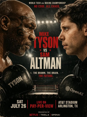
Image2Studio
Examples

gpt-image-2

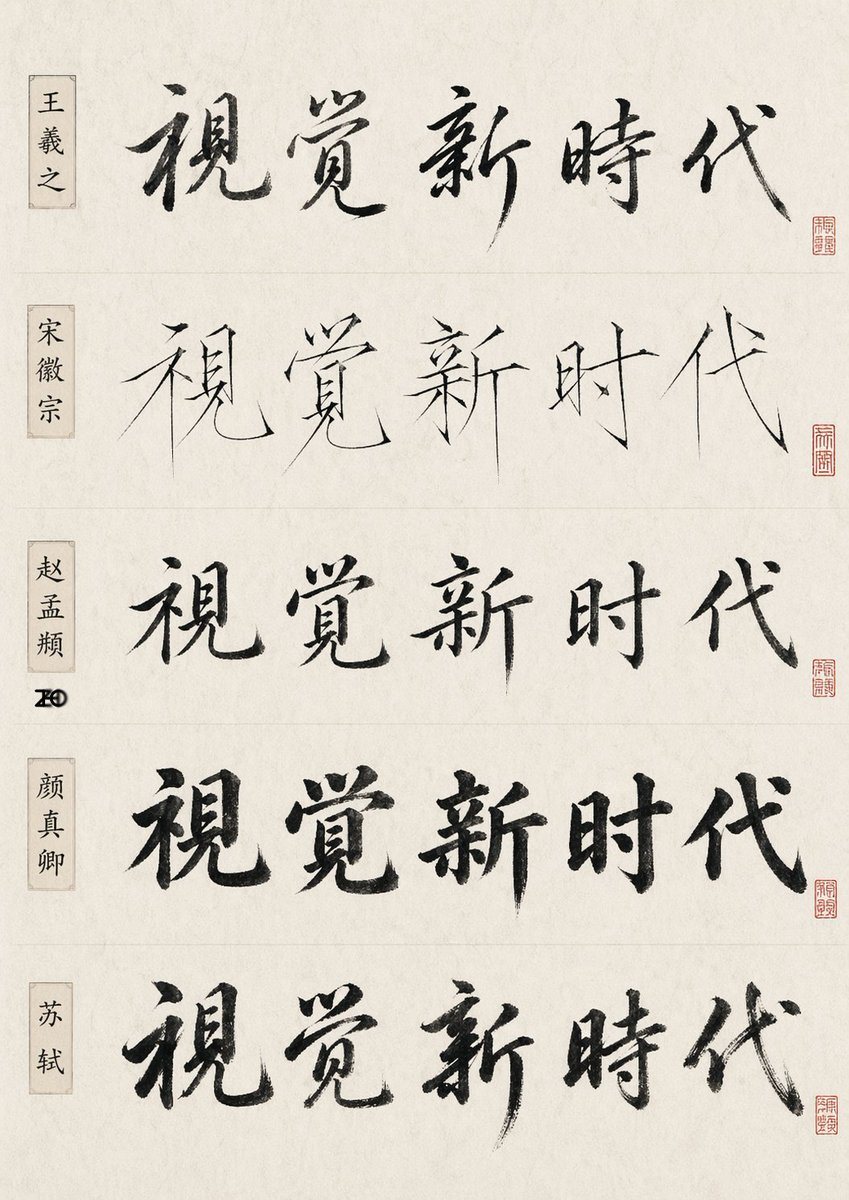
Chinese Calligraphy Comparison Sheet

Ready-to-edit Chinese calligraphy comparison sheet image prompt.

Ready-to-edit Chinese calligraphy comparison sheet image prompt.
Prompt

{"type":"Chinese calligraphy comparison sheet","subject":"the same five-character phrase written in five famous-calligrapher-inspired styles","text":{"main phrase":"视觉新时代"},"style":"minimal scholarly presentation, off-white rice paper texture, black ink brush calligraphy, subtle fiber grain, clean museum-reference layout","layout":{"orientation":"vertical poster","sections":[{"title":"王羲之","position":"top row, left label box","count":1,"labels":["视觉新时代"],"calligraphy style":"flowing semi-cursive, expressive ink variation, elegant and rhythmic brushwork"},{"title":"宋徽宗","position":"second row, left label box","count":1,"labels":["视觉新时代"],"calligraphy style":"very thin and sharp slender strokes, Song Huizong inspired 'slender gold' aesthetic, refined angular lines"},{"title":"赵孟頫","position":"third row, left label box","count":1,"labels":["视觉新时代"],"calligraphy style":"balanced regular-script influence with soft rounded transitions and controlled structure"},{"title":"颜真卿","position":"fourth row, left label box","count":1,"labels":["视觉新时代"],"calligraphy style":"bold heavy brushwork, upright dignified structure, thick ink-rich strokes"},{"title":"苏轼","position":"bottom row, left label box","count":1,"labels":["视觉新时代"],"calligraphy style":"free spirited running script, robust brush pressure, energetic literati feeling"}],"row count":5,"repeated phrase count":5,"left label count":5,"seal count":5},"details":{"left labels":"each row has a narrow vertical beige name cartouche with black Chinese characters","seals":"each row has one small red square seal near the lower right end of the calligraphy line, all slightly different","dividers":"faint horizontal divider lines separate the five rows","margins":"wide clean margins, centered composition","background":"warm ivory xuan paper with subtle aging and natural paper mottling"},"quality":"high-resolution print-like study sheet, authentic ink bleed and dry-brush texture, restrained elegant lighting, no extra decoration","parameters":{"main phrase":"{argument name=\"phrase text\" default=\"视觉新时代\"}","paper tone":"{argument name=\"paper tone\" default=\"warm ivory\"}","ink color":"{argument name=\"ink color\" default=\"black\"}"}}

Prompt structure
  • Modelgpt-image-2
  • Use casesocial-media-post
  • Styleeditorial, minimal, luxury
  • Aspect ratioFlexible
Best used for
  • Use casesocial-media-post
  • Styleeditorial, minimal, luxury
  • Recommended specs1:1, 4:5, 16:9, or 9:16
  • ModelGPT Image 2
How to customize

Use this Chinese Calligraphy Comparison Sheet prompt as a base. Replace the subject, product details, environment, lighting, brand colors, and output ratio while keeping the social-media-post intent and editorial, minimal, luxury direction stable.

Editable variables
  • SubjectReplace the product, person, scene, interface, or object being generated.
  • Use caseKeep or rewrite the destination as social media post, ad creative, cover image, poster, or ecommerce hero.
  • FrameChoose 1:1, 4:5, 16:9, or 9:16 based on the final placement.
  • Brand cuesAdd colors, materials, props, text-safe space, and the platform where the image will be used.
Recommended specs

Choose the frame for the destination first, then use 1K, 2K, or 4K based on output quality needs. Product images and posters usually benefit from higher resolution.

Pre-generation checklist
  • CheckSubject, lighting, composition, and frame are specific enough to review.
  • CheckText-safe space is included when the image will carry a headline or ad copy.
  • CheckResolution, credit cost, and final destination are checked before generation.
Why this prompt works

Chinese Calligraphy Comparison Sheet works because it starts from the image job, then controls subject, composition, lighting, style, and frame. It is best for social media post while keeping the editorial, minimal, luxury direction stable.

Common questions
  • Can I use it directly?Yes. Replace the subject, brand cues, and frame, then generate in Image2Studio.
  • Which ratio should I use?Choose 1:1, 4:5, 16:9, or 9:16 based on the destination.